Слайд 2
1.GENERAL PRINCIPLES AND ASSUMPTIONS
Technical analysis is a form
of security analysis that uses price and volume market
data, often graphically displayed.
Technical analysis can be used for any freely traded security in the global market and is used on a wide range of financial instruments, such as equities, bonds, commodity futures, and currency futures.
Technical analysis is the study of market trends or patterns and relies on recognition of patterns that have worked in the past in an attempt to predict future security prices. Technicians believe that market trends and patterns repeat themselves and are somewhat predictable because human behaviour tends to repeat itself and is somewhat predictable.
The usefulness of technical analysis is diminished by any constraints on the security being freely traded, by large outside manipulation of the market, and in illiquid markets.
Слайд 3
Another tenet of technical analysis is that the

market brings together the collective wisdom of multiple participants,
weights it according to the size of the trades they make, and allows analysts to understand this collective sentiment.
Technical analysis relies on knowledgeable market participants putting this knowledge to work in the market and thereby influencing prices and volume.
Technical analysis and fundamental analysis are equally useful and valid, but they approach the market in different ways. Technical analysis focuses solely on analysing markets and the trading of financial instruments, whereas fundamental analysis is a much wider ranging field encompassing financial and economic analysis as well as analysis of societal and political trends.
Technical analysis relies primarily on information gathered from market participants that is expressed through the interaction of price and volume. Fundamental analysis relies on information that is external to the market in an attempt to evaluate a security’s value relative to its current price.
Слайд 4
2.TECHNICAL ANALYSIS TOOLS
The primary tools used in technical
analysis are charts and indicators.
Charts provide information about past
price behavior and provide a basis for inferences about likely future price behavior. Various types of charts can be useful in studying the markets: line charts, bar charts, candlestick charts, and point and figure charts.
2.1 CHARTS
Слайд 5
2.1.1 Line Chart
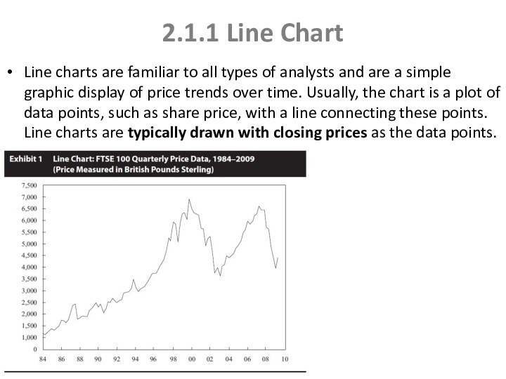
Line charts are familiar to all
types of analysts and are a simple graphic display
of price trends over time. Usually, the chart is a plot of data points, such as share price, with a line connecting these points. Line charts are typically drawn with closing prices as the data points.
Слайд 6
2.1.2 Bar Chart
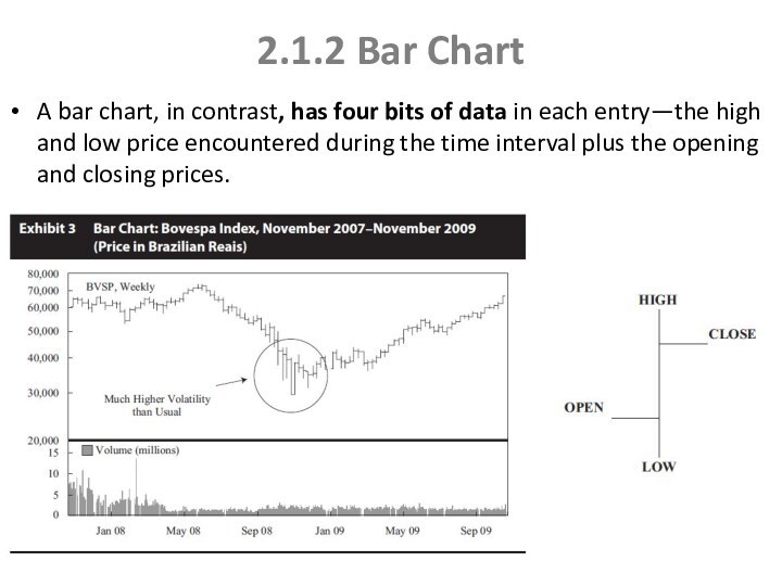
A bar chart, in contrast, has
four bits of data in each entry—the high and
low price encountered during the time interval plus the opening and closing prices.
Слайд 7
2.1.3 Candlestick Chart
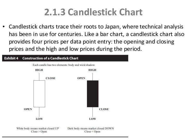
Candlestick charts trace their roots to
Japan, where technical analysis has been in use for
centuries. Like a bar chart, a candlestick chart also provides four prices per data point entry: the opening and closing prices and the high and low prices during the period.
Слайд 8
2.1.4 Point and Figure Chart
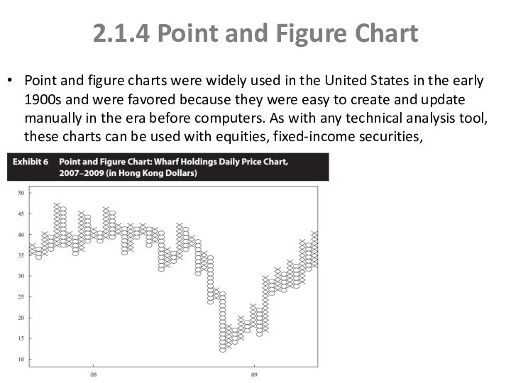
Point and figure charts
were widely used in the United States in the
early 1900s and were favored because they were easy to create and update manually in the era before computers. As with any technical analysis tool, these charts can be used with equities, fixed-income securities, commodities, or foreign exchange.
Слайд 9
Volume, Time Intervals
Volume is used to assess the
strength or conviction of buyers and sellers in determining
a security’s price. Some technicians consider volume information to be crucial. If volume increases during a time frame in which price is also increasing, that combination is considered positive and the two indicators are said to “confirm” each other. The signal would be interpreted to mean that over time, more and more investors are buying the financial instrument and they are doing so at higher and higher prices.
Most of the chart examples in this reading are daily price charts in that they show the price and volume on a daily basis. For short-term trading, the analyst can create charts with one minute or shorter intervals. For long-term investing, the analyst can use weekly, monthly, or even annual intervals.
Слайд 10
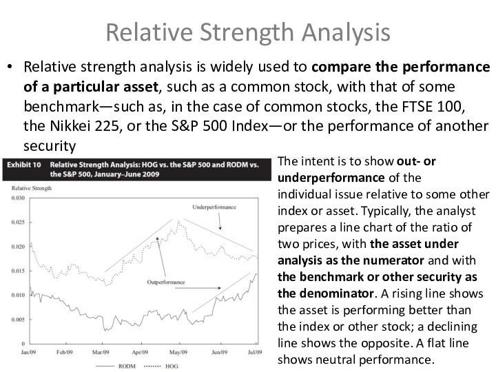
Relative Strength Analysis
Relative strength analysis is widely used
to compare the performance of a particular asset, such
as a common stock, with that of some benchmark—such as, in the case of common stocks, the FTSE 100, the Nikkei 225, or the S&P 500 Index—or the performance of another security
The intent is to show out- or underperformance of the
individual issue relative to some other index or asset. Typically, the analyst prepares a line chart of the ratio of two prices, with the asset under analysis as the numerator and with the benchmark or other security as the denominator. A rising line shows the asset is performing better than the index or other stock; a declining line shows the opposite. A flat line shows neutral performance.
Слайд 11
TREND
The concept of a trend is perhaps the
most important aspect of technical analysis. Trend analysis is
based on the observation that market participants tend to act in herds and that trends tend to stay in place for some time. A security can be considered to be in an upward trend, a downward trend, a sideways trend, or no apparent trend.
An uptrend for a security is when the price goes to higher highs and higher lows.
A downtrend is when a security makes lower lows and lower highs.
Two concepts related to trend are support and resistance. Support is defined as a low price range in which buying activity is sufficient to stop the decline in price. It is the opposite of resistance, which is a price range in which selling is sufficient to stop the rise in price.
A key tenet of support and resistance as a part of technical analysis is the change in polarity principle, which states that once a support level is breached, it becomes a resistance level.
Слайд 12
CHART PATTERNS
Chart patterns are formations that appear in
price charts that create some type of recognizable shape.
Common patterns appear repeatedly and often lead to similar subsequent price movements.
Chart patterns can be divided into two categories: reversal patterns and continuation patterns.
Reversal patterns signal the end of a trend. Common reversal patterns are the head and shoulders, the inverse head and shoulders, double tops and bottoms, and triple tops and bottoms.
Reversal Patterns
Слайд 13
Head and shoulders pattern
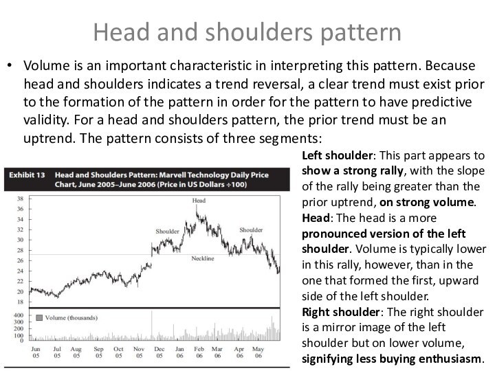
Volume is an important characteristic
in interpreting this pattern. Because head and shoulders indicates
a trend reversal, a clear trend must exist prior to the formation of the pattern in order for the pattern to have predictive validity. For a head and shoulders pattern, the prior trend must be an uptrend. The pattern consists of three segments:
Left shoulder: This part appears to show a strong rally, with the slope of the rally being greater than the prior uptrend, on strong volume.
Head: The head is a more pronounced version of the left shoulder. Volume is typically lower in this rally, however, than in the one that formed the first, upward side of the left shoulder.
Right shoulder: The right shoulder is a mirror image of the left shoulder but on lower volume, signifying less buying enthusiasm.
Слайд 14
Inverse Head and Shoulders
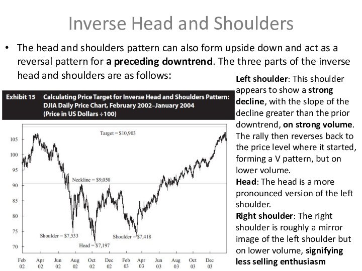
The head and shoulders pattern
can also form upside down and act as a
reversal pattern for a preceding downtrend. The three parts of the inverse head and shoulders are as follows:
Left shoulder: This shoulder appears to show a strong decline, with the slope of the decline greater than the prior downtrend, on strong volume. The rally then reverses back to the price level where it started, forming a V pattern, but on lower volume.
Head: The head is a more pronounced version of the left shoulder.
Right shoulder: The right shoulder is roughly a mirror image of the left shoulder but on lower volume, signifying less selling enthusiasm
Слайд 15
Setting Price Targets with Head and Shoulders Patterns
Once
the neckline is breached, the security is expected to
decline by the same amount as the change in price from the neckline to the top of the head.
The price target for the head and shoulders pattern is calculated as follows: Price target = Neckline – (Head – Neckline)
Calculating price targets for inverse head and shoulders patterns is similar to the process for head and shoulders patterns, but in this case, because the pattern predicts the end of a downtrend, the technician calculates how high the price is expected to rise once it breaches the neckline.
For an inverse head and shoulders pattern, the formula is similar to a head and shoulders pattern: Price target = Neckline + (Neckline – Head)
Слайд 16
Double Tops
A double top is when an uptrend
reverses twice at roughly the same high price level.
Typically, volume is lower on the second high than on the first high, signalling a diminishing of demand. The longer the time is between the two tops and the deeper the sell-off is after the first top, the more significant the pattern is considered to be. Price targets can be calculated from this pattern in a manner similar to the calculation for the head and shoulders pattern. For a double top, price is expected to decline below the low of the valley between the two tops by at least the distance from the valley low to the high of the double tops
Price target = Valley + (High of the double tops – Valley)
Слайд 17
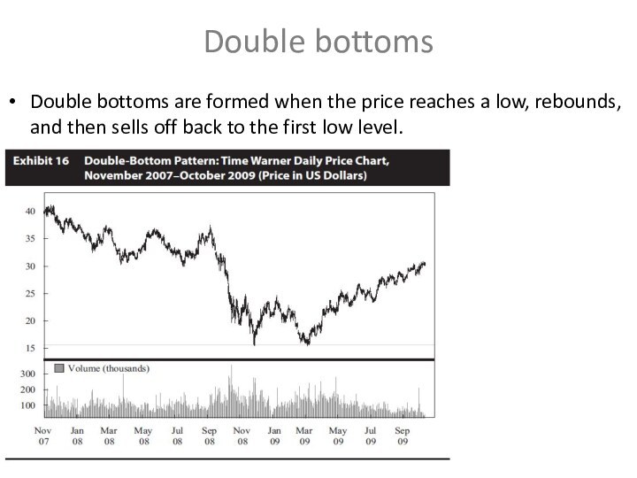
Double bottoms
Double bottoms are formed when the price
reaches a low, rebounds, and then sells off back
to the first low level.
Слайд 18
The reason of Double Tops and Bottoms patterns
For
an uptrend, a double top implies that at some
price point, enough traders are willing to either sell positions (or enter new short positions) that their activities overwhelm and reverse the uptrend created by demand for the shares. A reasonable conclusion is that this price level has been fundamentally derived and that it represents the intrinsic value of the security that is the consensus of investors.
With double bottoms, if a security ceases to decline at the same price point on two separate occasions, the analyst can conclude that the market consensus is that at that price point, the security is now cheap enough that it is an attractive investment.
Слайд 19
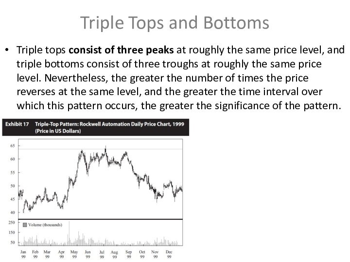
Triple Tops and Bottoms
Triple tops consist of three
peaks at roughly the same price level, and triple
bottoms consist of three troughs at roughly the same price level. Nevertheless, the greater the number of times the price reverses at the same level, and the greater the time interval over which this pattern occurs, the greater the significance of the pattern.
Слайд 20
Continuation Patterns
Continuation patterns indicate that a market trend
in place prior to the pattern formation will continue
once the pattern is completed. Common continuation patterns are triangles, rectangles, flags, and pennants.
Triangle patterns are a type of continuation pattern. They come in three forms, symmetrical triangles, ascending triangles, and descending triangles. A triangle pattern forms as the range between high and low prices narrows, visually forming a triangle.
Triangle patterns
Слайд 21
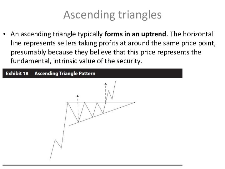
Ascending triangles
An ascending triangle typically forms in an
uptrend. The horizontal line represents sellers taking profits at
around the same price point, presumably because they believe that this price represents the fundamental, intrinsic value of the security.
Слайд 22
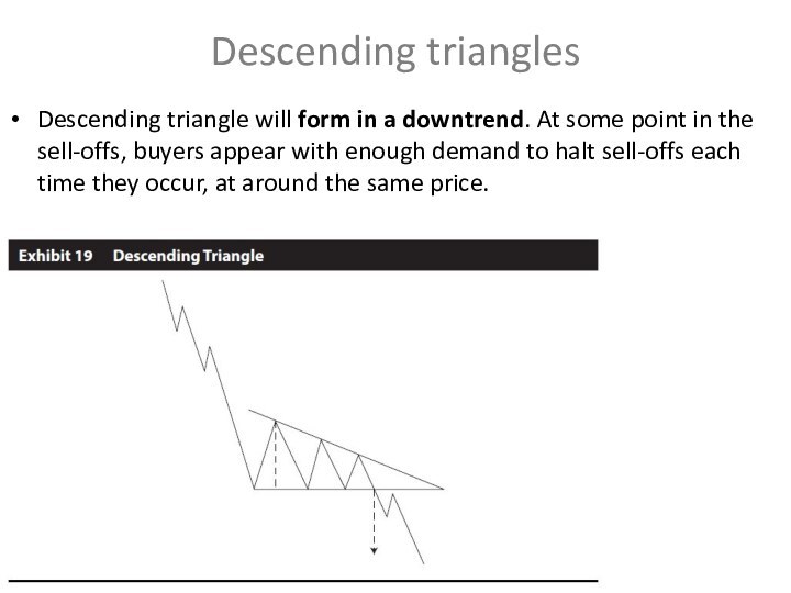
Descending triangles
Descending triangle will form in a downtrend.
At some point in the sell-offs, buyers appear with
enough demand to halt sell-offs each time they occur, at around the same price.
Слайд 23
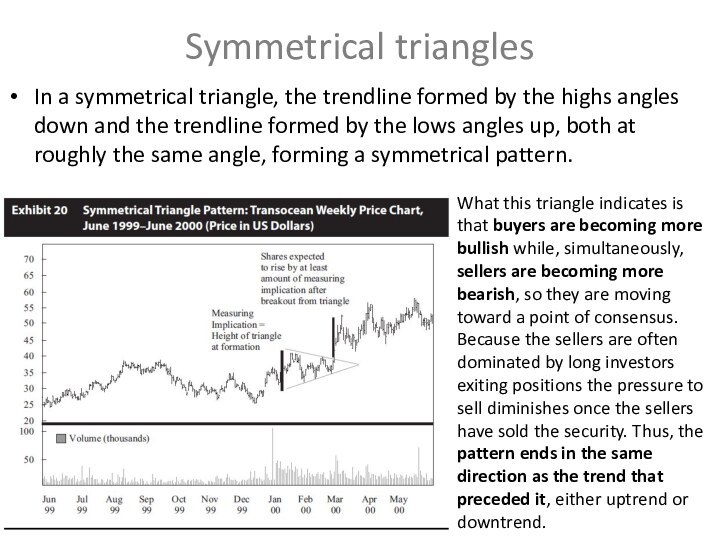
Symmetrical triangles
In a symmetrical triangle, the trendline formed
by the highs angles down and the trendline formed
by the lows angles up, both at roughly the same angle, forming a symmetrical pattern.
What this triangle indicates is that buyers are becoming more bullish while, simultaneously, sellers are becoming more bearish, so they are moving toward a point of consensus.
Because the sellers are often dominated by long investors exiting positions the pressure to sell diminishes once the sellers have sold the security. Thus, the pattern ends in the same direction as the trend that preceded it, either uptrend or downtrend.
Слайд 24
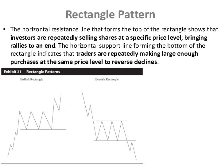
Rectangle Pattern
The horizontal resistance line that forms the
top of the rectangle shows that investors are repeatedly
selling shares at a specific price level, bringing rallies to an end. The horizontal support line forming the bottom of the rectangle indicates that traders are repeatedly making large enough purchases at the same price level to reverse declines.
Слайд 25
Flags and Pennants
Flags and pennants are considered minor
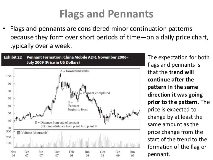
continuation patterns because they form over short periods of
time—on a daily price chart, typically over a week.
The expectation for both flags and pennants is that the trend will continue after the pattern in the same direction it was going prior to the pattern. The price is expected to change by at least the same amount as the price change from the start of the trend to the formation of the flag or pennant.
Слайд 26
2.2 Technical Indicators
The technical analyst uses a variety
of technical indicators to supplement the information gleaned from
charts. A technical indicator is any measure based on price, market sentiment, or funds flow that can be used to predict changes in price. These indicators often have a supply-and-demand underpinning; that is, they measure how potential changes in supply and demand might affect a security’s price.
Price-based indicators somehow incorporate information contained in the current and past history of market prices. Indicators of this type range from simple (e.g., a moving average) to complex (e.g., a stochastic oscillator).
2.2.1 Price-Based Indicators
Слайд 27
2.2.1.1 Moving Average
A moving average is the average
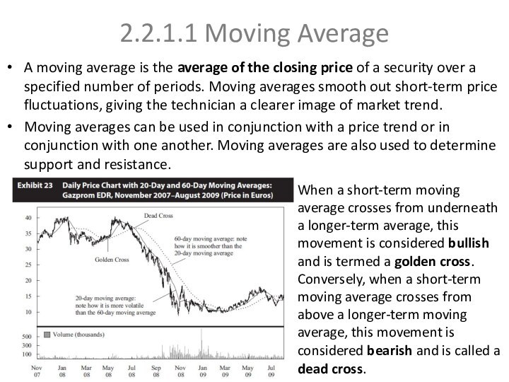
of the closing price of a security over a
specified number of periods. Moving averages smooth out short-term price fluctuations, giving the technician a clearer image of market trend.
Moving averages can be used in conjunction with a price trend or in conjunction with one another. Moving averages are also used to determine support and resistance.
When a short-term moving average crosses from underneath a longer-term average, this movement is considered bullish and is termed a golden cross. Conversely, when a short-term moving average crosses from above a longer-term moving average, this movement is considered bearish and is called a dead cross.
Слайд 28
2.2.1.2 Bollinger Bands
Bollinger Bands consist of a moving
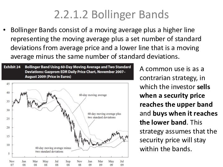
average plus a higher line representing the moving average
plus a set number of standard deviations from average price and a lower line that is a moving average minus the same number of standard deviations.
A common use is as a contrarian strategy, in which the investor sells when a security price reaches the upper band and buys when it reaches the lower band. This strategy assumes that the security price will stay within the bands.
Слайд 29
2.2.2 Momentum Oscillators
One of the key challenges in

using indicators overlaid on a price chart is the
difficulty of discerning changes in market sentiment that are out of the ordinary. Momentum oscillators are intended to alleviate this problem. They are constructed from price data, but they are calculated so that they either oscillate between a high and low (typically 0 and 100) or oscillate around a number (such as 0 or 100).
Technicians also look for convergence or divergence between oscillators and price. Convergence is when the oscillator moves in the same manner as the security being analysed, and divergence is when the oscillator moves differently from the security.
Momentum oscillators should be used in conjunction with an understanding of the existing market (price) trend. Oscillators alert a trader to overbought or oversold conditions. In an overbought condition, market sentiment is unsustainably bullish. In an oversold condition, market sentiment is unsustainably bearish. In other words, the oscillator range must be considered separately for every security.
Слайд 30
2.2.2.1 Momentum or Rate of Change Oscillator
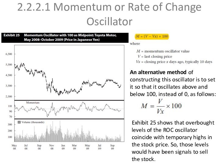
An alternative
method of constructing this oscillator is to set it
so that it oscillates above and below 100, instead of 0, as follows:
Exhibit 25 shows that overbought levels of the ROC oscillator coincide with temporary highs in the stock price. So, those levels would have been signals to sell the stock.
Слайд 31
2.2.2.2Relative Strength Index
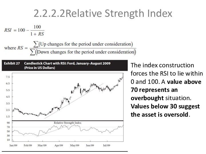
The index construction forces the RSI
to lie within 0 and 100. A value above
70 represents an overbought situation. Values below 30 suggest the asset is oversold.
Слайд 32
2.2.2.3 Stochastic Oscillator
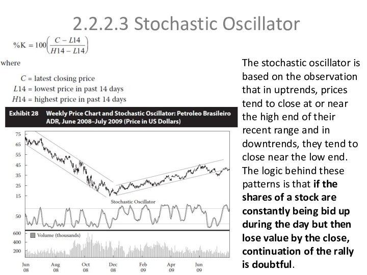
The stochastic oscillator is based on
the observation that in uptrends, prices tend to close
at or near the high end of their recent range and in downtrends, they tend to close near the low end. The logic behind these patterns is that if the shares of a stock are constantly being bid up during the day but then lose value by the close, continuation of the rally is doubtful.
Слайд 33
2.2.2.4 Moving-Average Convergence/Divergence Oscillator
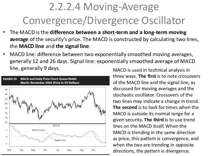
The MACD is the difference
between a short-term and a long-term moving average of
the security’s price. The MACD is constructed by calculating two lines, the MACD line and the signal line:
MACD line: difference between two exponentially smoothed moving averages, generally 12 and 26 days. Signal line: exponentially smoothed average of MACD line, generally 9 days.
MACD is used in technical analysis in three ways. The first is to note crossovers of the MACD line and the signal line, as discussed for moving averages and the stochastic oscillator. Crossovers of the two lines may indicate a change in trend. The second is to look for times when the MACD is outside its normal range for a given security. The third is to use trend lines on the MACD itself. When the MACD is trending in the same direction as price, this pattern is convergence, and when the two are trending in opposite directions, the pattern is divergence.
Слайд 34
2.2.3 Sentiment Indicators
Sentiment indicators attempt to gauge investor
activity for signs of increasing bullishness or bearishness. Sentiment
indicators come in two forms: investor polls and calculated statistical indices.
A wide range of services conduct periodic polls of either individual investors or investment professionals to gauge their sentiment about the equity market. The most common of the polls are the Investors Intelligence Advisors Sentiment reports, Market Vane Bullish Consensus, Consensus Bullish Sentiment Index, and Daily Sentiment Index, all of which poll investment professionals, and reports of the
2.2.3.1 Opinion Polls
Слайд 35
2.2.3.2 Calculated Statistical Indices
The other category of sentiment
indicators are indicators that are calculated from market data,
such as security prices. The two most commonly used are derived from the options market; they are the put/call ratio and the volatility index. Additionally, many analysts look at margin debt and short interest.
The put/call ratio is the volume of put options traded divided by the volume of call options traded for a particular financial instrument. Investors who buy put options on a security are presumably bearish, and investors who buy call options are presumably bullish. The volume
The CBOE Volatility Index (VIX) is a measure of near-term market volatility calculated by the Chicago Board Options Exchange. Since 2003, it has been calculated from option prices on the stocks in the S&P 500. The VIX rises when market participants become fearful of an impending market decline.
Put/call ratio
CBOE Volatility Index
Слайд 36
Margin debt and Short interest
Margin debt is

also often used as an indication of sentiment. As
a group, investors have a history of buying near market tops and selling at the bottom. When the market is rising and indices reach new highs, investors are motivated to buy more equities in the hope of participating in the market rally. A margin account permits an investor to borrow part of the investment cost from the brokerage firm. This debt magnifies the gains or losses resulting from the investment.
Investor psychology plays an important role in the intuition behind margin debt as an indicator. When stock margin debt is increasing, investors are aggressively buying and stock prices will move higher because of increased demand
Short interest is another commonly used sentiment indicator. Investors sell shares short when they believe the share prices will decline.
Short interest ratio = Short interest/Average daily trading volume
Some people believe that if a large number of shares are sold short and the short interest ratio is high, the market should expect a falling price for the shares because of so much negative sentiment about them. A counter-argument is that, although the short sellers are bearish on the security, the effect of their short sales has already been felt in the security price.
Слайд 37
2.2.4 Flow-of-Funds Indicators
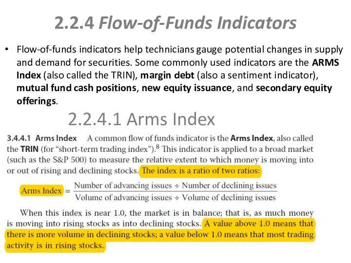
Flow-of-funds indicators help technicians gauge potential
changes in supply and demand for securities. Some commonly
used indicators are the ARMS Index (also called the TRIN), margin debt (also a sentiment indicator), mutual fund cash positions, new equity issuance, and secondary equity offerings.
2.2.4.1 Arms Index
Слайд 38
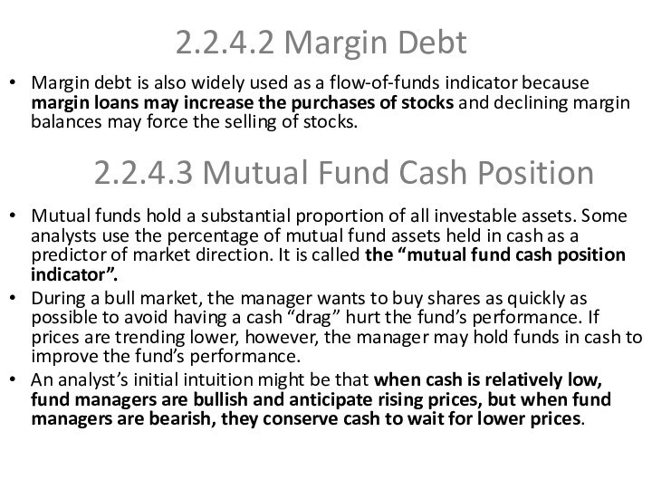
Margin debt is also widely used as a
flow-of-funds indicator because margin loans may increase the purchases
of stocks and declining margin balances may force the selling of stocks.
Mutual funds hold a substantial proportion of all investable assets. Some analysts use the percentage of mutual fund assets held in cash as a predictor of market direction. It is called the “mutual fund cash position indicator”.
During a bull market, the manager wants to buy shares as quickly as possible to avoid having a cash “drag” hurt the fund’s performance. If prices are trending lower, however, the manager may hold funds in cash to improve the fund’s performance.
An analyst’s initial intuition might be that when cash is relatively low, fund managers are bullish and anticipate rising prices, but when fund managers are bearish, they conserve cash to wait for lower prices.
2.2.4.2 Margin Debt
2.2.4.3 Mutual Fund Cash Position
Слайд 39
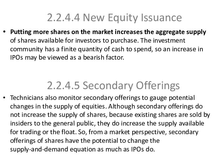
Putting more shares on the market increases the
aggregate supply of shares available for investors to purchase.
The investment community has a finite quantity of cash to spend, so an increase in IPOs may be viewed as a bearish factor.
Technicians also monitor secondary offerings to gauge potential changes in the supply of equities. Although secondary offerings do not increase the supply of shares, because existing shares are sold by insiders to the general public, they do increase the supply available for trading or the float. So, from a market perspective, secondary offerings of shares have the potential to change the supply-and-demand equation as much as IPOs do.
2.2.4.4 New Equity Issuance
2.2.4.5 Secondary Offerings
Слайд 40
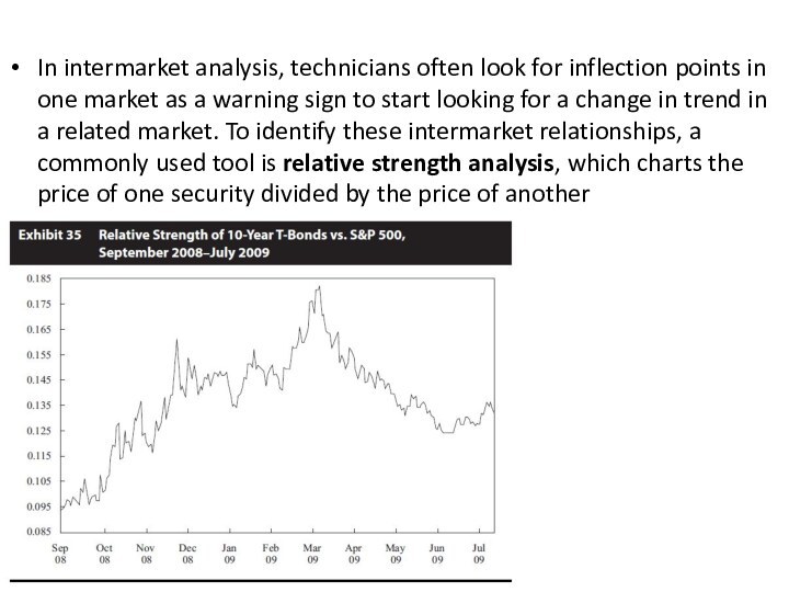
INTERMARKET ANALYSIS
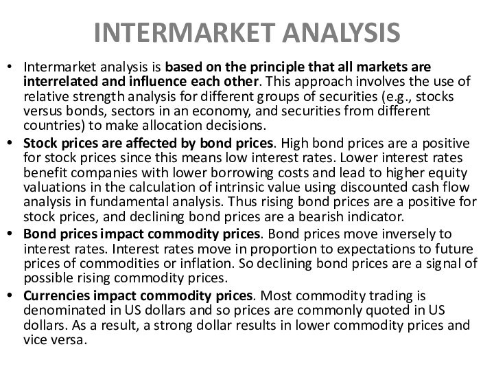
Intermarket analysis is based on the principle

that all markets are interrelated and influence each other.
This approach involves the use of relative strength analysis for different groups of securities (e.g., stocks versus bonds, sectors in an economy, and securities from different countries) to make allocation decisions.
Stock prices are affected by bond prices. High bond prices are a positive for stock prices since this means low interest rates. Lower interest rates benefit companies with lower borrowing costs and lead to higher equity valuations in the calculation of intrinsic value using discounted cash flow analysis in fundamental analysis. Thus rising bond prices are a positive for stock prices, and declining bond prices are a bearish indicator.
Bond prices impact commodity prices. Bond prices move inversely to interest rates. Interest rates move in proportion to expectations to future prices of commodities or inflation. So declining bond prices are a signal of possible rising commodity prices.
Currencies impact commodity prices. Most commodity trading is denominated in US dollars and so prices are commonly quoted in US dollars. As a result, a strong dollar results in lower commodity prices and vice versa.
